Happy New Year!!!
Well, if you know me, you know I love cool fonts.
I love finding fonts, collecting fonts and using fonts. I'm a font fanatic!
I even admit to being proud/bashful when I can identify a font on some advertising out in the world.
"Hey, that's Pacifico!"
or
"Nooo, not another sign with Papyrus!!!"
Yep, that's me.
I've been reading and researching some new ideas and tools to help me in my day-job of advertising, marketing and social media for my church.
In my search, I've come across a great (Canadian!) website resource called "Pro Church Tools" out of Niagra, Ontario. They have all sorts of amazing ideas, tips, and resources for churches or anyone creating graphic design, using social media, producing videos and more.
This week I found their blog post titled "The 2-Step Foolproof Approach to Creating Graphics that Don’t Suck" - a long title but one of my new favourite resource blog posts!!
The guys at Pro Church Tools walk you through the EASIEST way to come up with a graphic to use on social media or in print.
1. Pick a great, flat colour from here: flatuicolors.com (one of my new fav websites!)
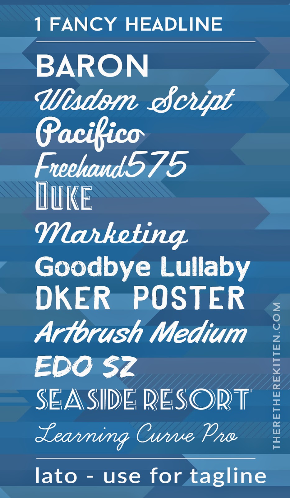
2. Pick 1 fancy font for the headline + 1 simple font for the tagline, if needed. (list here)
3. Bonus - if you feel creative, layer your colour's transparency down to 80% over a cool photo from your own library or from a royalty free website. (good list here)
The result....easy, attractive graphics! (see the image above)
I've created a cheat sheet for my desk at work that I want to SHARE with YOU from the FREE FONTS mentioned in the post along with a solid colour and layered image behind.
* You can download the PDF file here or after the image below.
Please go visit our friends at Pro Church Tools.
Take some time to listen to some of the really helpful podcasts or read some blog posts. They also do have a FREE tool kit you can sign up for and they do contract work creating videos, too!
For now, enjoy my download and keep finding cool ways to use cool fonts!!
~ K


No comments:
Post a Comment